Comparative Study of Blockchain Visualization Strategies on Mobile Devices
My Computer Science degree is done. I wrote the thesis while running Studio Sphere, in the industry context of FiDi Tech, whose desktop analytics platform serves foundation teams at networks including Moonbeam, zkSync and Mantle.
The research question was: how do different visualization strategies for blockchain network data perform on mobile devices in terms of usability and information clarity? Not which chart type reads best, but which whole architecture holds up on a phone: layout, navigation, density, interaction.
The gap it addresses is narrow and real. Blockchain visualization research concentrates on expert desktop environments and rarely evaluates the user experience at all. Empirical work on mobile data visualization is scarce in its own right. No published study compares strategy-level alternatives for blockchain ecosystem data on a smartphone.
Three strategies on the same data
Blockchain data is temporal, categorical and hierarchical at once. A network like Moonbeam hosts applications across DeFi, Gaming and Infrastructure, each tracked through transaction volume, unique active wallets, gas fees and asset price. A six-inch screen cannot carry all of it, so every layout is a decision about what to defer.
I designed three that decide differently, on an identical data basis and an identical metric set.
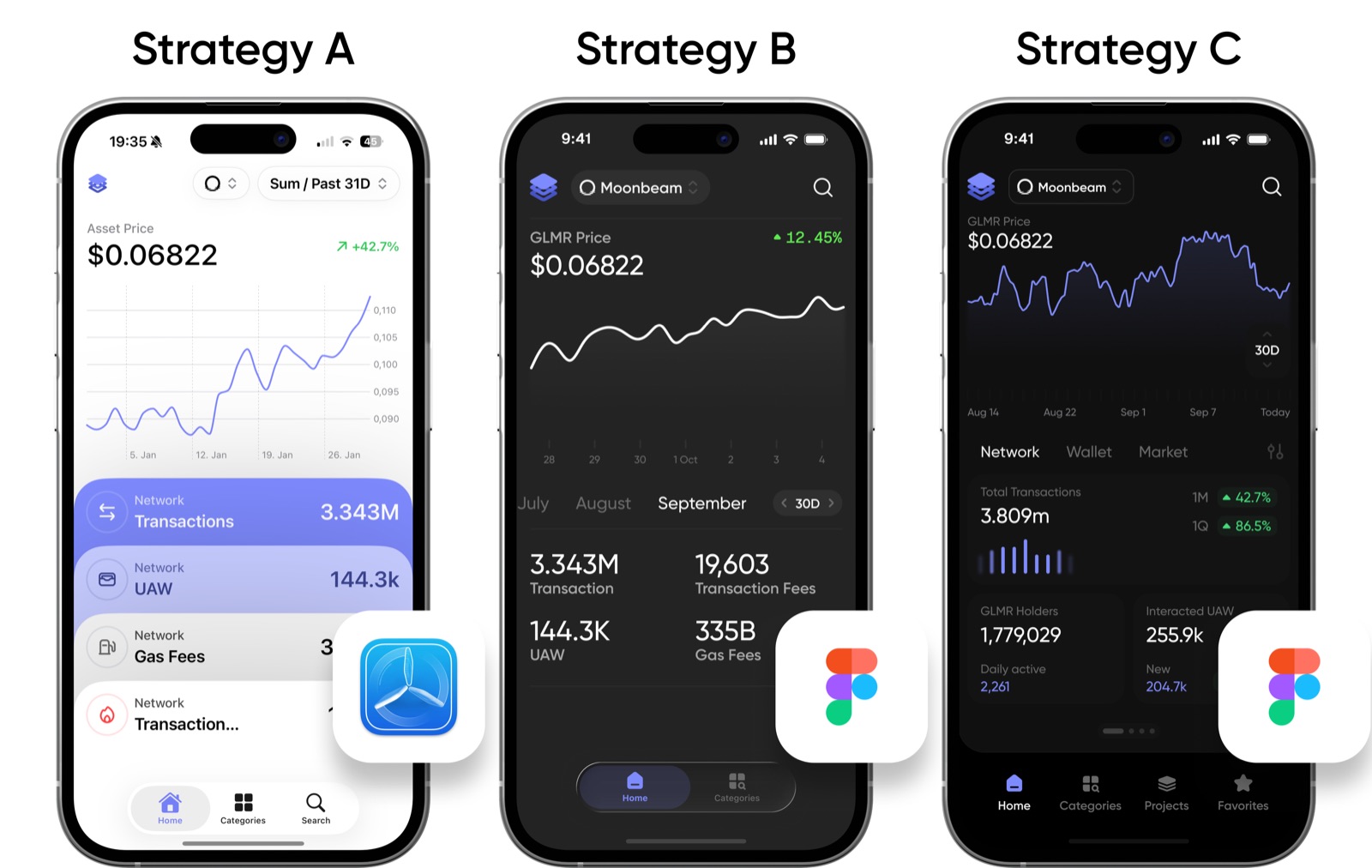
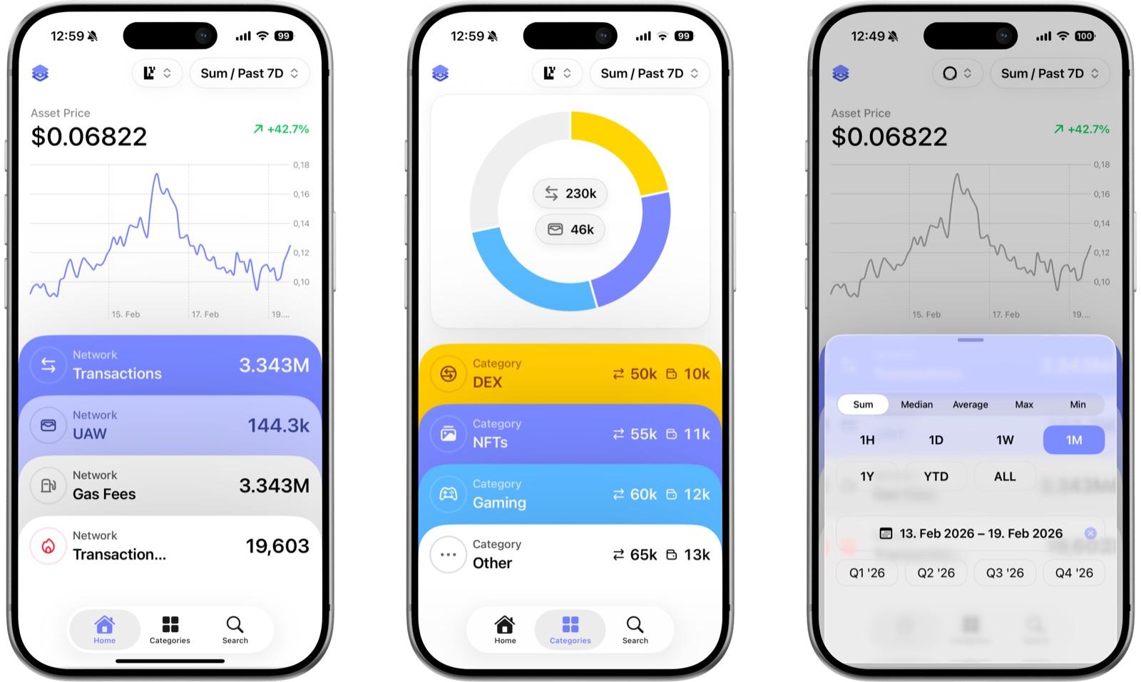
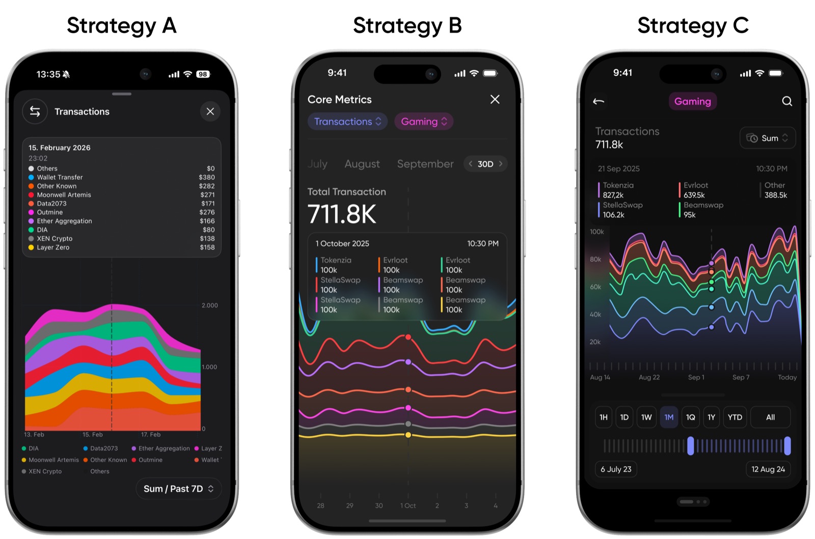
Strategy A, card-based progressive disclosure. The overview compresses to one chart and four numeric values; every metric-specific visualization sits behind an explicit card tap. Implemented as a native iOS application in Swift and SwiftUI, with dynamic data, continuous gesture interaction and haptics.
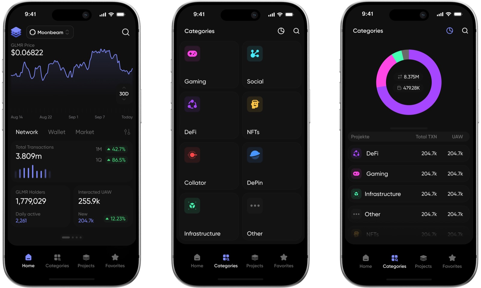
Strategy B, narrative contextualization with category browsing. Charts paired with interpretive text, reached through search and a chip-based filter system. Interactive Figma prototype.
Strategy C, multi-chart exploration with carousel navigation. Charts, KPI grids and wallet visualizations rendered simultaneously, with further chart types across swipeable panels. Interactive Figma prototype.
Density increases from A through B to C. That gradient is the independent variable.
How they were evaluated
Ten participants, recruited from FiDi Tech and its professional network across three experience tiers, from blockchain analytics professionals to people with no prior exposure to technical applications. Within-subjects: everyone used all three, on their own phone, remotely.
The instruments were a modified five-item System Usability Scale, per-task experience items, and a comparative section that rated data clarity and ease of use on identical scales. Measuring usability and information clarity as two constructs rather than one composite was a deliberate choice, and it is the reason the study has a result worth reporting.
Results
| SUS | Ease of use | Clarity | |
|---|---|---|---|
| A, progressive disclosure | 78.0 | 4.80 | 4.50 |
| B, narrative scaffolding | 69.4 | not measured | 3.67 |
| C, high density | 59.5 | 3.00 | 3.30 |
The ranking is consistent across every instrument. Confidence declines most steeply of all items, from 4.00 on A to 2.80 on C, which is what cognitive load theory predicts: intrinsic load stays constant because the data is the same, while extraneous load rises with what is on screen at once.
Where clarity and ease come apart
Read the two right-hand columns against each other. Strategy A is rated easier to use (4.80) than clear (4.50). Strategy C is rated clearer (3.30) than easy to use (3.00). Across the gradient, ease of use falls by 1.80 points while clarity falls by only 1.20.
The two dimensions therefore do not lie on one quality axis. Strategy A’s progressive disclosure defers the stacked area charts and ranked bar views that carry the analytical substance; a user can complete a smooth interaction on the home screen without ever meeting them. It optimises the operational layer at the expense of the analytical one. Strategy C inverts that: the information is present and structured, at 3.60 for overview quality and 3.80 for readability, but findability drops to 3.30 and clutter to 2.70. Present, and harder to reach.
Strategy B’s middle position is not an average of the two. The narrative text was meant to reduce interpretive effort, but participants described the prototype in terms of navigation difficulty rather than narrative quality. Several could not find the filter controls at all. A navigation barrier encountered before the content caps whatever clarity the text might have added.
Expertise moderates all of this, and most strongly where density is highest. The SUS gap between expert and non-expert participants is 21 points on Strategy C against 14 on Strategy A. Domain knowledge functions as a buffer against the cost of density.
What I would carry into other work
Progressive disclosure is the right default for complex data on a phone, at a specific granularity. One chart and four values on the overview; everything else behind an explicit tap. The principle is not new; what the evaluation adds is the level at which it works.
But numeric KPI cards without trend context are too reductive. A transaction count with no trend line, a wallet figure with no distribution. Sparklines or directional arrows would raise clarity at the overview without breaking the disclosure structure. This is the one change I would make to Strategy A before shipping it.
Running text competes with the chart for the same scarce space. A narrative paragraph displaces a chart, a legend, or whitespace. On a six-inch screen spatial position is the most salient channel available, and giving it to prose is a misallocation. Short inline annotations attached to specific chart features cost less space and land where attention already is.
Density is not a fixed design parameter but an expertise-dependent one. Strategy C’s SUS scores ranged from 30 to 90, and that spread tracks blockchain knowledge more closely than any other participant characteristic. An interface that opens restrained and expands on demand serves both ends. One participant proposed exactly that, unprompted.
The reversal itself is a diagnostic. When a mobile dashboard rates higher on clarity than on ease, the architecture is probably too dense. When ease exceeds clarity, it is probably hiding something the user needs. That test costs two extra questionnaire items, and it works in any domain where high-dimensional data has to be read on a phone: financial analytics, IoT monitoring, ad reporting.
And one that is not about visualization at all: building the native application myself gave me a much sharper sense of what software architecture actually costs, in hours and decisions rather than in theory. It changed how I scope work. Estimating honestly, knowing where complexity hides, recognising when a decision will create problems three steps later. That understanding is not optional for anyone leading product work, not because you need to write every line, but because it is what lets you have an honest conversation about scope and risk.
Limitations
The most consequential is fidelity asymmetry. Strategy A was a native application; B and C were Figma prototypes with static screen variants. Multiple participants described Strategy A as “finished” or “most complete”, and perceived completeness is known to influence usability ratings independently of interaction quality. An unknown share of A’s 8.6-point lead over B and 18.5-point lead over C is implementation rather than design.
A uniform Figma build would have removed the confound and also removed any comparison of interaction quality, which is a substantial part of what makes a mobile interface work. The trade was deliberate, and holding the data domain constant while varying both design and fidelity at least documents a confound that comparative studies often carry silently.
Beyond that: ten participants is near the low end for this kind of study, the sample was recruited from the company whose product Strategy A is, no counterbalancing was applied to form order, all prototypes used structurally realistic mock data rather than live feeds, and the evaluation captured self-reported clarity without verifying that participants read the charts correctly. Value-extraction tasks with checkable answers would ground that construct in behaviour instead of self-report.
The paper
Bachelor of Science, Media Informatics, Hochschule Osnabrück. 92 pages, including the evaluation instruments, the task scenarios and the raw data.
Product updates
When something I build ships or changes. No more than that.